Challenge
The homepage was failing to create a strong first impression for both prospective and existing customers. Extensive customization led to visually inconsistent and outdated-looking pages, causing the sales team to actively avoid showcasing the homepage during demos. At the same time, hospital coordinators and medical residents reported that poor layout and information hierarchy made it difficult to identify and complete required tasks. As a result, many medical students disengaged from the homepage entirely, instead relying on external tools such as their hospital’s intranet to find critical information.
Project Details
My Role: Senior UX Designer, User Research
Platform: Web
Team: Project Manager, Engineers
Project Field: Resident Management Suite for Teaching Hospital
Outcomes
- Medical Residents preferred the redesign in every preference test conducted
- Relocated actionable data above the fold and increased Medical Resident satisfaction
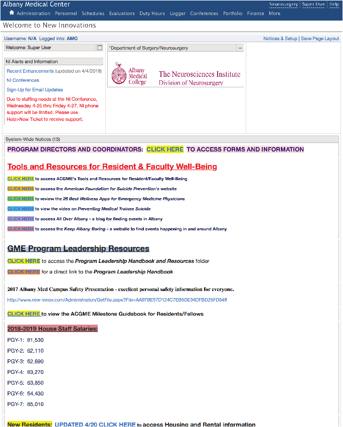
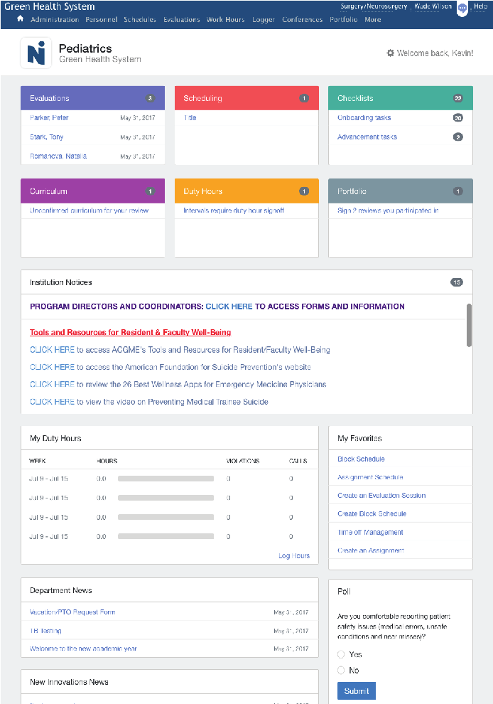
Existing Homepage. Coordinators at the hospital manage the information found on the homepage. Their job is to make sure Residents see important information when they log into the system. Coordinators used the flexible text editor to use colors as well as text styles to increase visibility for certain links.
User Testing
Taking a screenshot of the existing homepage, I drew a box around each unique section of the page. After recruiting some Residents, we asked the participants to rank and over the list of sections. We followed the same test with Coordinators and had them rank the importance.
The results of test demonstrated that Coordinators and Residents were not in alignment on what was important. Coordinators for example thought the logo was an important section of the homepage but was ranked in the bottom two by Residents. System wide notices were ranked highly by Coordinators but Residents ranked them in the middle because they have access to the same information on the intranet at their hospital.
I created a series of wireframes to share with internal stakeholders and our Subject Matter Expert who used to work as a Coordinator and arrived at what nicknamed the “sunshine design” because it gave positive assurance when tasks were completed. The most important piece of information on the homepage based on the testing was daily tasks that the Residents logged into the software to complete. I made those easy to find and color coordinated. Another change was to remove some of the text editor options